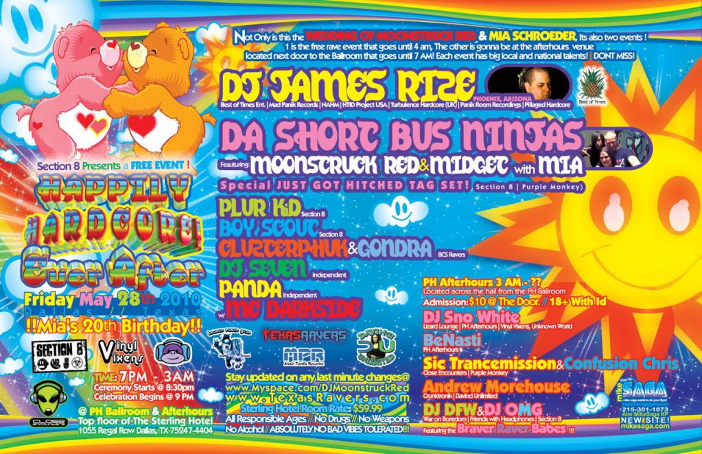
I don't see how our wedding event classifies under "the worst and most lazy in graphic design" as it was made by Mike Saga a pretty well known graphic designer in the Rave and Industrial Scenes. But it definitively classifies as cheesy and corny which is what we were going for ^_^ You can go to MikeSaga.com to see his work. Thanks BadRaveFlyers ^_~
Yeah, I really liked this one. Font is easy to read, larger DJ's get larger font, list are discernible and separable, and the color and design adequately advertised what the event was all about - which was one of the most beautiful events I've ever been to in over a decade! There's a reason I fought for almost a year to get my hands on a hard copy.
It was a djs wedding that he threw togethor and made free. Maybe you should actually read this shit before you start hating.Now go back on to ravelinks or any other plur site and start trolling again.
I don't see how our wedding event classifies under "the worst and most lazy in graphic design" as it was made by Mike Saga a pretty well known graphic designer in the Rave and Industrial Scenes. But it definitively classifies as cheesy and corny which is what we were going for ^_^ You can go to MikeSaga.com to see his work. Thanks BadRaveFlyers ^_~
ReplyDeleteYeah, I really liked this one. Font is easy to read, larger DJ's get larger font, list are discernible and separable, and the color and design adequately advertised what the event was all about - which was one of the most beautiful events I've ever been to in over a decade! There's a reason I fought for almost a year to get my hands on a hard copy.
ReplyDeleteHaha I was there! Wtf this flyer was sick!
ReplyDeleteIt was a djs wedding that he threw togethor and made free. Maybe you should actually read this shit before you start hating.Now go back on to ravelinks or any other plur site and start trolling again.
ReplyDeleteI hardly see how this is classified as a bad or even lazy event flyer...
ReplyDelete